
This room is an absolute favourite of mine, and it’s a great example of how a space can be transformed into a haven using soft furnishings, art and accessories.
As the primary function of the space was to be a reading room, we began with a well-proportioned and sleek sofa that on it’s own could perhaps be seen to be a little subdued.
Read on to see how we made things more interesting!
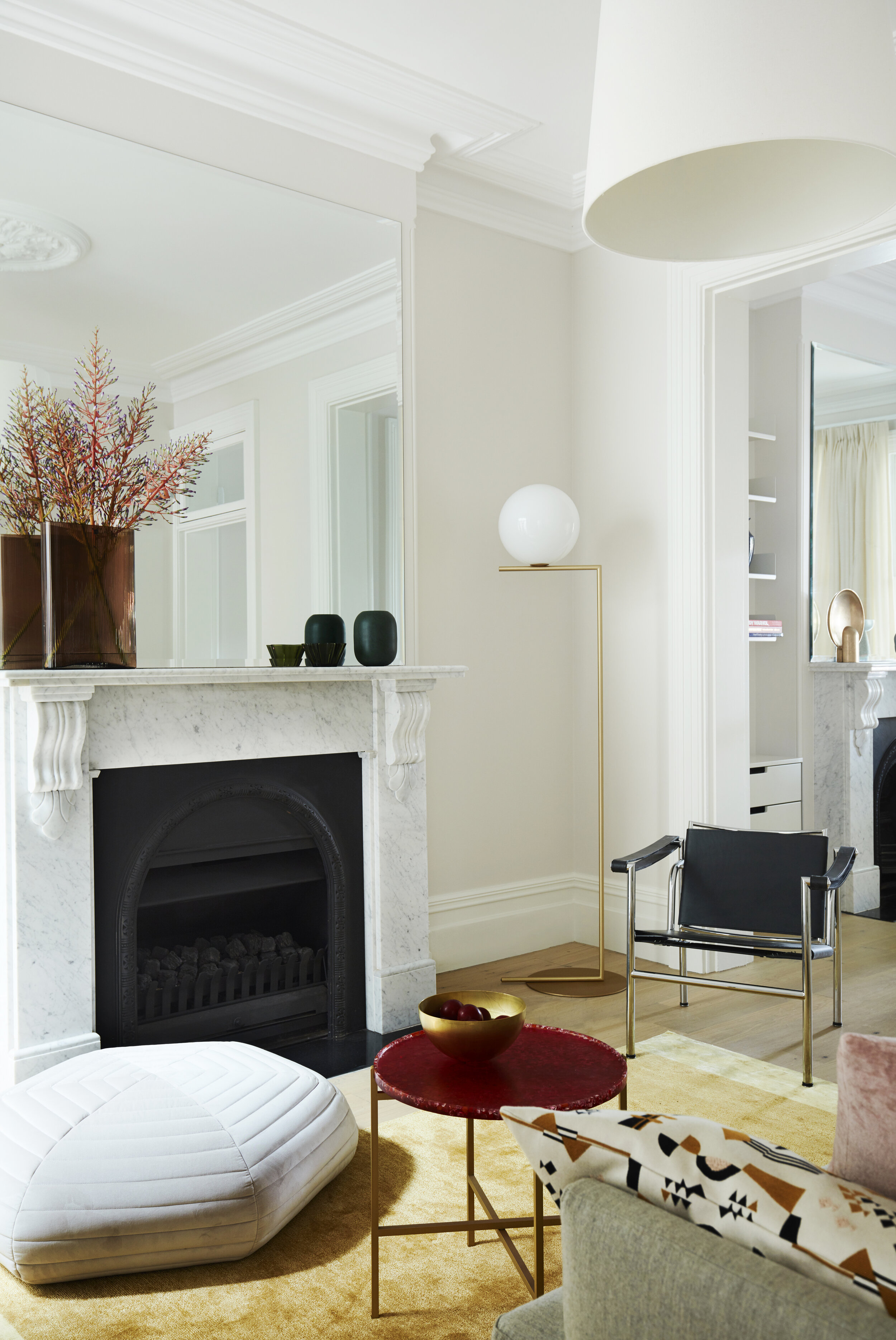

The first decorative addition to the scheme was a rug that would clearly define the space around the fireplace, in a delicious two toned honey yellow colour that was selected to form the beginnings of the colour palette. The composition of the rug is wool and art silk, which is a synthetic fibre that resembles silk.
A sofa can really benefit from some feature cushions, both to break up the large expanse of fabric that is often selected in safe and neutral colour and material, and also to introduce different textures into the scheme for tactile enjoyment. In general, introducing pattern through cushions is a wise approach, and pairing this with a bock colour can be really effective.
Accessories are a fabulous way to introduce even more colour and materials. One way to begin is to look for somewhere to place a large object, and the mantelpiece provided this opportunity in this room. The generously sized fluted glass vase in fiery orange was the perfect find, and a couple of smaller ceramic objects of similar colours were placed alongside to complement this piece.
There’s nothing quite as satisfying as finding a piece of art that speaks to you on an emotional level, that works well within the space, and finally that is the right scale for the wall and room. When this happens, high fives all around.

DESIGN PRO TIPS
Rugs are an excellent way to inject a colour into a scheme, as well as providing a soft material underfoot – be sure to take your shoes off and test before you buy! Rugs are also key to defining a space so have a really good think about size and proportion.
As an interior designer, colour selection does come relatively easily but if in doubt use the colour wheel as a guide to find complementary colours.
When selecting cushions, be sure to select a fabric that is not otherwise in the room, something that might be better used on a smaller piece. Some examples include sheepskin, velvet, and leather.
Use accessories to bring more colour and personality if desired, or simply select neutral objects that balance out the composition of a room
DESIGN CLUB QUESTIONS
Do you find the yellow of the rug joyful and uplifting? What colour would you have chosen?
Can you see that the complementary colours to this yellow are purples and pinks? What else might have worked well?
Can you see how the small scale of the pattern on the cushion suits the compact space and furnishings? Would a large pattern have created the same impact?
What other accent colours do you think would have worked well for a feature accessory given we had the rug and cushions?
Do you want the same results with your own interior project?
If so, get in touch today, we would love to hear from you